About Me

My photo
All I know to be is doing what I love, and what I love to do is art. From graphic design to photography to fine art, I love to do it all. My experiences as a student has taught me many ways to create better design as well as more expressive art. From learning the intricacies of Adobe Creative Suite to the delicacies of letterpress and silk screen printing, I find myself to be a more well-rounded, ambitious, and creative individual. With all of this at my disposal, there is no limit to what I can create.

Tuesday, August 24, 2010

Imported Egyptian Honey Packaging Project


For my Package Design 1 class, I was to create an overall package design for honey. The honey producing company could either be an existing company or one that I made up. After researching honey, its history, and various uses, I decided to create my own honey company that originates in Egypt and produces its own organic and exotic brand of honey. I named my company Nesw-bit Apiaries. Nesw-bit is an English transcription of an Egyptian heiroglyph that translates into 'he of the bee', one of the many names of the pharoah. The company logo was created by using the heiroglyph of the bee as a starting point, but further developed to be more approachable and less aggressive than the original heiroglyph.
The lotus and acacia flowers are indigenous to Egypt and grow wild near the Nile. I used deep colors and golden yellow as well as Egyptian ornament to reflect the richness of Egyptian culture. Because of the unique shape and contour of the jars I chose to use, I had to create a hanging tag for the nutrition information. The jars are wrapped in cloth a decorative cloth to further enhance the Egyptian feel.

Personal Identity


Stationery System


Detail: Business Card Alternative 1
Detail: Business Card Alternative 2
Detail: Business Card Alternative 3
Detail: Business Card Alternative 4


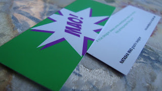
For my Identity 1 class, one of our first projects was to create a personal identity. I had to create a mind map of all of the things that make up who I am, then select 3 key words from that map and use them as concepts to develop an identity. One of the 3 words was Batman. This may seem unusual, but Batman and I have a lot in common. First of all, he has no super powers and what makes him great is his innovation, resourcefulness, and creativity. Not only is he all that, he is completely awesome too. Thinking about the action scenes in the old Batman series, I used a clever way to use my last name, Mao, the way they used the word "Pow!" in a jagged cloud. It's also convenient that my last name rhymes with pow. This logo represents my versatility and dynamic as well as my light-hearted and fun-loving attitude.

Experimental Photography


Something a little more experimental with photography. I played with shutter speeds and apertures to capture different types of movements to see what sort of image they created.

Eve Photography


I took these photos of a good friend of mine in a beautiful courtyard of a fancy hotel. I enjoy photography as much as I do design. I wanted to capture a certain cool and a distinct sweetness that makes up her personality.

Dream Photography


These are some photos I took for a project about dreams. I tried to create atmospheric and mysterious images by using natural light and slowing the shutter speed. Most dreams are hazy and difficult to remember, so with these images I tried to capture that feeling.

Viaduct Venue Brochure Covers


The Viaduct is a Tacoma-based venue for local musicians to perform. There is also a recording studio and screen printing studio for both the venue and the artists to make products. For one of my projects, I had to create a series of brochures. I chose the Viaduct because of the uniqueness of its type of company. The covers are interesting collages of various, seemingly random things that create compelling images. These images not only engage the viewer visually but also on an intellectual level because of the profoundness of the different things the images are referencing. The collages make the viewer think about what the images are telling them. To contrast the eccentric illustrations, I kept the type simple enough to get to the point and be readable but also interesting with overlap and difference in type colors.

Genesis Film Festival Postcard


A friend of mine asked me to make him a postcard for a film festival he was holding. He didn't give me too much direction, only the information he wanted on it. So I created 2 very different versions for him to choose from. One is much more conservative and minimal, while the other is a bit more expressive and has more personality.

Postage Stamp Project

This is a stamp sheet that I designed for the San Francisco Aids Foundation as a project for one of my classes. Each individual stamp features a person of significance that fell victim to the epidemic of AIDS. Instead of using portraits, I wanted to show the viewer who these people were with one glance at the pictures and a small descriptor. I kept everything black and white so to emphasize the red of the ribbon and remind people that there are many who have succumbed to such a disease and that with the purchase of these stamps, they are helping to fund research for a cure. This project proved challenging because of the extremely small space allotted to design something legible and aesthetically pleasing.

Eye Spy Books Identity and Book Jackets

Meg Lanslow Mystery/Humor Series Book Covers


Detail: Spines
Detail: Back


Eye Spy is a logo I developed for a made-up publishing company. Eye Spy Books publishes for mystery and humor authors. Donna Andrews is one those writers and is known for her avian-themed mystery novels. I developed a series of 3 book jackets based on the content and attitude of her novels. Her novels tend to be light-hearted, funny, quirky, and sometimes outrageous, so to capture this I went with a light hand-drawn quality and minimized my color palette. I tried to keep the illustrations relevant to each individual story as to engage the reader without giving away the entire story. The Eye Spy logo is in black and white so as not to distract from the overall design.

Existing Company New Identity

Existing Logo and Three Concepts/Descriptor Words
New Logo

Stationery System
Detail: Business Card
Detail: Letterhead and Envelope
This is a new identity for existing company, Interscope Records. After my research of the record label, I found out that the company was renowned for signing on the most controversial artists as well as continually breaking the mold of traditional music recording. Interscope Records was a new company that took risks with their eccentric artists and music. In order to do this reputation justice, I decided to do a simple wordmark, using the words, "Iconoclastic, Eccentric, and Tension" as a guide to emphasize the attitude of the company. The way the type is sliced or cut creates tension and intrigue the same way the musical talent captivates audiences.

Les Joulins Jazz Bistro Identity

New Logo for Les Joulins Jazz Bistro in Color and Black and White
Stationery System
Detail: Business Card
Detail: Coaster

For my Graphic Design 1 class, I had to design an identity for a local restaurant. I chose Les Joulins in downtown San Francisco because it is a truly unique dining experience and there are no other restaurants in the city of this kind. It is a jazz bistro that has live jazz performances every night featuring both local and famed musicians. I developed a rustic, more organic identity to fully capture the atmosphere of the restaurant. This treatment of the illustration is more personal and appeals to customers more than a more mechanical treatment.

Talofa Enrichment Center Branding Project


Stationery System
Detail: Envelope
Detail: Business Card
Detail: Letterhead


Information Brochure


Various Practical Applications


The concept behind this project is, in a nutshell, "Home is where the heart is." Growing up being half Samoan and half Caucasian, I didn't learn the native language of my father's family. Having a strong desire to connect with my culture, I made up this organization and based my designs on elements of the Polynesian culture. The core identity is a depiction of the Samoan 'fale' which translates as house or home. The fale represents a place to discover where your roots lie and where you come from. This organization is one where the Polynesian people and culture are celebrated through various activities, classes, and events. To further capture the essence of the organization, I created a secondary graphic based on the woven patterns of many Polynesian apparel and decoration. I've applied both the core identity and secondary graphics to various relevant applications.